In the climate of Milan of the thirties with the subtitle Magazine of Aesthetic and Graphical Technique, was born “Campo Grafico.” By the will of two artists of the advertising poster art – Carlo Dradi and Attilio Rossi – and a group of printers willing to enter into the Italian graphic tradition an already transposed modernity in art and architecture also began a project of graphic experimentation intended to mark indelibly the sector.
In 66 issues published from 1933 to 1939, independently self-produced and all different in the layout and on the covers, “Campo Grafico” proposed radical reversals of printing priority, focusing on raising awareness towards the European art abstract-rationalist outcomes and asymmetric beauty of an unusual composition, with a continuous current title on the double-sided or the innovative use of white space, with the title at the height of the fourth page. Concepts unpredictable at the time and that animated debates and columns, such as the famous “Rassegna del Brutto” (“Review of Ugliness”): ethical self-awareness of the designer, need for contact between the product and the public, importance of clarity in institutional communication (urban transport tickets, bureaucratic forms).
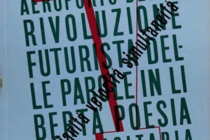
No wonder the number 3-5 Year VIII, which marked the closing of the experience of “Campo Grafico”, was a monograph devoted to that, among the vanguard, was the most revolutionary in terms of typesetting, Futurism. The Marinetti’s movement had in fact distorted, if not canceled, every possible setting rule letterpress from paroliberismo, real nightmare for any heir – at the beginning of the twentieth century – of Gutenberg’s art.
Head of the triple package was the talented Enrico Bona, the more refined esthete – and more autarkic – among the “Campo Grafico” employees. The man from Trentino curated in a capillary manner, supported by the minds of Cesare Andreoni and Guido Modiano, content and form of each individual sheet, whether it was of pages intended to accommodate the activities of the sacred monsters of Futurism – from Marinetti to Russolo – whether they were occupied by advertisements: Bona created advertisements specifically addressing aesthetics and futuristic style, staying true to one of the innovations of “Campo Grafico”, the first magazine to offer advertisers who produced inks to promote them reproducing color plates with works by great artists.
Quotes and references to contemporary art, compositional dynamism in image-text dialogue, chromatic inserts even in text-only pages, photos and photomontages inserts, tactile use of different cards by color and weight or even alternative media to the paper. These are the main guidelines of “Campo Grafico” enterprise that are in the issue about Futurism – wanted in the thirtieth anniversary of the first Manifesto – a masterful application, with unreached peaks of modernity, such as talking tables in cellophane, autonomous together and dialoguing compared to those which were to overlap. After that masterpiece Bona returned to confront with Marinetti and his companions in 1941, signing one of the last truly experimental pages of Futurist typography, L’aeropoema futurista dei legionari in Spagna by Bruno Aschieri: text on yellow paper, the page numbers declined in ornamental design, parolibera cover art, all futuristic invention, but evocative of the lessons of the Bauhaus and De Stijl. Because Bona was, and would have remained, a “Campista”.
Cover “Campo grafico Aeroporto della rivoluzione futurista delle parole in libertà”. Year VII. N. 3-5. Milano, 1939
 English
  Italiano