The book’s journey was a very long one. I really love Shakespeare’s sonnets, their content, their style, the way they are written, their imagery… they somehow filtered through me, grabbed me by the heart and created such an impression on me that I had to visually interpret them. Many months of my life are incorporated within this book and the path to it was long.
The process of engraving the etching on zinc plates for the frontispiece illustration was long and absorbing but it permitted me to achieve various shades of greys and blacks which fill the composition with either almost unnoticeable strokes, like the silk of the spider’s web, or with thick and black lines.
The search for the best way to arrange the written parts of the text led to the decision to write all the 154 sonnets by hand, linking elements of ancient calligraphy with my handwriting, as well as adding graphic elements to the title page. While I was writing the calligraphy I was living in a world full of letters and I forgot about everything else: I took pleasure in the process, I was delighted by the outline of every single letter… I like the letters “e” and “k” the most – when you write them, your shoulders and neck become tense and your hand slides over the paper on its own. I also like the capital letters “L” and “H” with their horizontal lines like waves on the ocean, and the “S” too for its importance and smoothness. I like to write the combination of letters “th”, more precisely I like their tails that create rhythms for the entire page and consequently, the book.
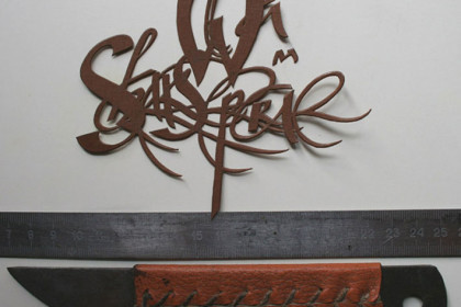
I made a careful choice of which paper to use. It would be terrible to cut hand-made paper off with a knife, therefore the pieces of paper for each page were carefully torn off by hand. The book binding was created from natural leather, previously worked to reach the necessary thickness and softness. The book headbands were sewed from two-tone Iris threads. The applications on the cover reflect the calligraphy from the title page, creating a resonance with the content of the book, and their colours add to the colour of the leather.
The metallic parts of the cover were produced by hand from zinc plates, and in their silhouette they resemble tongues of flames – like the flames of love in the sonnets. At the same time, the apertures between the flames and the contrast between the light zinc placed on the dark leather create an impression of openwork lace. The engraved grape leaves on zinc are designed to impart romance to the flames of love, and the parallel patterns of leaves and vines have something in common with the parallel elements of calligraphy inside the book.
I would like to say a big thank to everybody that helped me in this project, over all to my Guardian Angel, who was by my side the whole time and supported me however best he could, morally and financially, without letting me wander away from my intended path.
 English
  Italiano


